
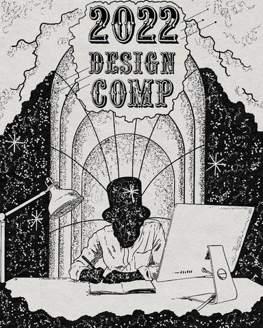
ENTRIES FOR THE 3RD ANNUAL CHD DESIGN COMP
HAVE NOW CLOSED!
From April 1st Until April 30th!

It's on again, for young and old...
"Holy shit, is that design comp back on already again!?" - Everyone.

It is a jewellery design competition - in which entrants will design a Sterling Silver Ring OR the new addition of the Pendant division!
It was originally slated for later this year, but we felt there was no better time than now to dust off the Faber Castells, peel back the surgical glove and starting designing your RING!
 ...do you enter?
The Design Concept will be entered with images, sketches and/or explanations of the thought behind the piece.
If you can't draw - no worries at all, just compile a bunch of images that portray the concept.
See Cooper's above, for an example of a great custom design break down.
It should include:
- A design name
- The ring shape/style
- Any and all designs and engravings - including side details
- Your own personal hallmark - which can be a small symbol, signature or emblem to represent you as a designer.
You'll then enter your submission through a form online (we'll keep you posted on this).
YOU CAN ENTER AS MANY DESIGNS AS YOU LIKE!
- We love hidden detail & meaning. Don't neglect the inner band engravings.
- If you are using text, make sure to include fonts.
- Use example of our rings to show the design shape/style.
 ...would you bother?
Besides stretching out the creative banjo-string and the numbing few weeks you'll have in self-isolation... The winner will have their piece produced and listed online for an exclusive short run, (in which you will take design royalty on). A runner-up design will also be chosen and produced for the second place designer.

 ...is it?
Entries will open APRIL 1st and close on the 30TH
The winners will be drawn by the team at CHD. Throughout the competition term, we will be posting images of the designs to gauge appeal, which will influence the final decision. We did originally want to do a voting system, however we didn't want this to be overrun by some stray sweetheart with 100k followers voting in their pig meat design.

Let's have a big focus on the "HOW"...
We thought we'd take the time here to spec out some of the important finer elements of the Design Comp.
It should include;
1. A design name
2. The shape/style
3. Any and all engravings, including side details
4. Your own personal hallmark
THE DESIGN NAME
Something that I wouldn't have previously recommended to give much focus too. However, last year, it strangely had a lot of clout. Not overly in the judgement of who won, but it was just cool to see how many people really attached themselves and their vote to the design's name.
So give this some good thought.
Last years, 'Ya mums ring' garnered a bit of support... Which I am assuming was from the name alone.
SHAPE & STYLE
There are three main styles that you should approach with.
1. Traditional Signet.
This is the approach of having a specific standard signet shape (Oval, Cushion etc.) that incorporates a standard engraving.
When choosing this approach, consider the design itself and which signet shape best suits the artwork. Don't neglect the sides!
With words like 'standard' and 'traditional', it's easy to fob this approach off. But in all honesty, it's hard to beat. They're timeless and the designs are also very recognisable.
2. Sculptural
This approach is where the design itself, is actually the entire ring. Such as our Konig Skull ring. Think 'sculptures' and the 3D feel to the entire piece.
3. 'Mixed'
As it says on the tin... This mixes both sculptural elements and standard signet shapes. We can't look past last years winning design, Prosperity, which takes on this design style.
Yon don't need to deliberate on these styles too much. As it is the design concept that will get you across the line, but if it really supports the design, let us know!
WHAT FINGER?
When designing the ring, its worth considering 'what finger' this is intended for. This is what we will generally do when designing. ESPECIALLY if it's a pinky ring.
So, here are some hints;
Pinky;
The outside small finger is the ideal placement for the traditional styled signets. Works very well with flush sitting oval designs and pieces with side detail.
Ring;
As the name suggests, this is your 'ring finger'. It wears most rings designs well, especially those traditional designs; cushion, round & rectangular signets.
Middle;
The centre finger loves symmetry and sold bold design. It wears circular and square shapes well, especially with a central feature, such as a stone or notable design.
Index;
The index finger enjoys similar designs as the middle finger. Both can accommodate larger bolder designs, as well as the index wearing side detail well - as it can be viewed on the hand.
Engravings & Designs
This element to the design comp is fairly self explanatory. But let me add a few things...
You don't need to overthink the design; remember its not an art competition! It can be simple and just timeless. We found last year that a lot of people just resonated with some designs - as also, they will potentially have the opportunity to wear the ring that you designed. Therefore, the fat lady next to a bowl of fruit or a pack of dogs wearing sunglasses playing poker, painted in oil on canvas, may get you behind a velvet rope, but not far in the signet ring comp...
THE DEVILS IN THE DETAIL...
There's thousands of master ideas for rings, believe me. We have always found that customers focal point often goes to those unique little hidden details.
Keep that in mind after you slap Mona Lisa on the face of signet...
This may included some text engraved on the inside. Or a small symbol, that pulls the design together.
YOUR OWN PERSONAL HALLMARKS
This is an important aspect to the design.
It will include;
- The alloy ("925" for Sterling Silver).
- "2021" for the year it was cast.
- "SYD" for where it was cast
And, your own personal hallmark.
It can be a small signature or symbol. Get creative with this. Think, how can you as the designer be denoted in the ring?


"MAKER'S MARK"
One area of the Design Comp that has been given far more attention and respect than I first anticipated, is the inclusion of the 'Hallmark' or 'Maker's Mark'.
So to give the breakdown again, of the essentials of a Design Comp submission;
1. A Design Name
2. The Ring Shape/Style
3. Any and All Designs & Engravings
4. Your own personal hallmark or more accurately 'Maker's Mark' - which identifies you you as a designer. This will be a small stamp on the inside of the ring, next to the other hallmarks (such as 925 for Sterling Silver).
It's become the unintentional Design Comp within the Design Comp. From the first year to the second, the concepts and style of hallmarks ramped up 10 fold. Some of which, you'd be happy slapping on the face of the signet, as they looked so good.
Some further detail...
It represents you as the designer, which we'd recommend doing one of two ways;
- Your initials or condensed signature. Your initials are usually written in a monogram style or unique way.


- Or a small symbol or emblem.


_______________
MORE TO THE POINT; HOW do I enter?
Enter through the Form button at the top or bottom of this page (which will be made available on April the 1st).
It can be submitted as;
- A PDF document
- Just a photo or scan of a page
- Or, it can be just a long winded description, with a piss-weak drawing on the back of a ciggie pack
YOU CAN ENTER AS MANY TIMES AS YOU'D LIKE!
The Design Comp is NOW LIVE.
Enter your design through the button above or at the bottom of the page.
From April 1st Until April 30th!


