Made With Purpose. Allowed To Age.

Concept, The Messenger

Posted by Ryan Purdie on

Whoever headed up the PR of the modern ‘angels’, is a genius. 

The familiar humanised imagery of ‘angelos’ is a stark difference from the dark reality of the scriptural descriptions.

If they were kind, then grifting any warmth or comfort upon those they were looking to help, would have been a hard sell.

Interpretations of angels and their relationship with humans, runs deep through theology. However, I am more interested in the core etymology - origin of the word - and their depiction in artwork. 

The linguistic finish line for us, ‘angel’, is a direct translation from the Latin angelus and the Greek angelos, literally meaning ‘messenger’. 

Why am I focusing on this element?


Some might guess that I don’t want to be fumbling about in precious religious script, accidentally offending billions around the globe. Others may guess that I’m hedging my bets for doomsday by avoiding an over commitment to any ‘correct’ representation of angelos.


Well, both might be right…

But, my focus is here… Angels, have tooled us up with all the components of an epic design.


Feathers and the broader wings, always make for great layered texture. Once any 'stepping' feature in a design is oxidising and the high point polished back, it pops. The eye centralises focus and to me, the highly tumultuous religious field isn’t what I’m looking to cross. I’m going further back, ’the messenger’ has an important role. One that arrives before the scriptural debate flares.


Again, this is where we jump ship and allow the wearer to establish the important identity of The Messenger.
Let me lay down some important analysis here on my own work. Our mission, is always to provide the best possible canvas for your piece to have legacy. We aren’t establishing the intrinsic value, were creating the ability for it to brew, the rest is on you.
 
That final line rhymed, and good god, I’m leaving it. 
Welcome, The Messenger.


 SHOP NOW

Read more →

For a Good Time, Not A Long Time...

Posted by Ryan Purdie on

This might be the snowball... Into a year of Design Comp pieces...


Every year we find ourselves adding a few additional designs to be released.

This year, we've gone down to third place for the Master Of Fate design, to be released as a One Day Exclusive. Sold for 24 Hours Only, then never again...
 
"A reminder that you ultimately control your own destiny and have the power to shape your life as you will it."
- Rachel Wong (Designer of Master Of Fate)


WHY IS THE 'ODE'!?

If you've just arrived, then this concept might be new for you.
 
If you've been with us for a while and you've started to feel the tempo increasing, then you'll understand how much we love ODE's (One Day Exclusives).
 
It all started with the Monthly Exclusive periods. The concept still held strong when we condensed these periods down and actually, it intensified every element of the limited release times. 

 
So we introduced, the One Day Exclusive. In which we'd sell a design, for 24 hours only, then never again. 
 
The exclusivity of these designs is to build a further intrinsic value into your piece - beyond the surface aesthetic. The idea of your particular ring design being cranked out and sold for years to come, we feel dilutes the significance of that little piece of metal perched on your knuckles. What's the good worth of an heirloom if the company is still selling that design once you hand it on? Or no defined purpose or importance of that period it was sold for? There's still something to be said about the stories that you build into the ring yourself, however we want this to be shared by the select, dedicated few.


It's hard not to get romantic about your own label and believe me when I say that I have enough objectivity to realise that most people don't give a fuck. But I still love the idea that two individuals, that could be worlds apart geographically and living contextually vastly different lives, still were both present within these 24 hours and now share a piece of the CHD community... I think that's pretty cool. 


Exclusivity is a core constraint that we impose on ourselves, but an important one for our customers. At least in 30 days, 12 months or 50 years from now - if you see this ring on another paw, you'll know that this thing poked its head up for 24 hours only and that's the shot the world got...


So, what are you still hanging around for these deep into some ramblings, haven't you heard? You only got 24 hours, get on it!!


SHOP NOW

Read more →

Master Of Fate, ODE.

Posted by Ryan Purdie on


This might be the snowball... 

Every year we find ourselves adding a few additional designs to be released.

This year, we've gone down to third place for the Master Of Fate design, to be released as a One Day Exclusive. Sold for 24 Hours Only, then never again...


"A reminder that you ultimately control your own destiny and have the power to shape your life as you will it."
- Rachel Wong (Designer of Master Of Fate)


This will be released on September 29th. 
Mates don't let mates miss ODE's. Let them know & set up a reminder below...
 
_


WHAT IS THE 'ODE'!?

If you've just arrived, then this concept might be new for you.


If you've been with us for a while and you've started to feel the tempo increasing, then you'll understand how much we love ODE's (One Day Exclusives).


It all started with the Monthly Exclusive periods. The concept still held strong when we condensed these periods down and actually, it intensified every element of the limited release times. 


So we introduced, the One Day Exclusive. In which we'd sell a design, for 24 hours only, then never again. 


The exclusivity of these designs is to build a further intrinsic value into your piece - beyond the surface aesthetic. The idea of your particular ring design being cranked out and sold for years to come, we feel dilutes the significance of that little piece of metal perched on your knuckles. What's the good worth of an heirloom if the company is still selling that design once you hand it on? Or no defined purpose or importance of that period it was sold for? There's still something to be said about the stories that you build into the ring yourself, however we want this to be shared by the select, dedicated few.


It's hard not to get romantic about your own label and believe me when I say that I have enough objectivity to realise that most people don't give a fuck. But I still love the idea that two individuals, that could be worlds apart geographically and living contextually vastly different lives, still were both present within these 24 hours and now share a piece of the CHD community... I think that's pretty cool. 


Exclusivity is a core constraint that we impose on ourselves, but an important one for our customers. At least in 30 days, 12 months or 50 years from now - if you see this ring on another paw, you'll know that this thing poked its head up for 24 hours only and that's the shot the world got...
So, what are you still hanging around for these deep into some ramblings, haven't you heard? You only got 24 hours, get on it!!
Read more →

Wabi Sabi, Behind The Winning Design.

Posted by Ryan Purdie on

Let the designs with contrast of a high polish and deep detail, take over...

There are two key aspects to Wabi Sabi, that make it a home run. Maybe not what you'd expect either... 

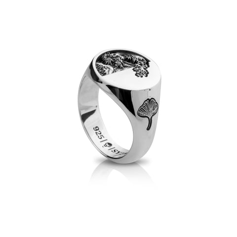
Whether conscious or not, there has been a shift towards design styles that incorporate a very notable contrast between a minimalist side and a high detailed sculptural element. The combination works beautifully BUT, it's not a sure thing...

Secondly, this is maybe more subtle... I personally have always had an affinity for marrying heritage design motifs that are generally infused with a degree of nostalgia, with a modernised design component. 

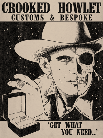
Not only in our ring designs, but we do this with our branding material. For example our Custom Ad Creative was brewed from those vintage ciggarette ads that always had very direct messaging. (See below).

 
What's the relevance to winning design... You may be seeing the reveal here. 

Wabi Sabi, has this exact appeal with a beautiful unity of the very recognisable, generational artwork or The Great Wave and built into a modernised signet.

Utilising true homage and design style.


Asymmetry, is an important aspect to the 'half-half' design style. It can't be just by nature of the split design feature. It needs to have a feeling of balance with the asymmetry. This is what Wabi Sabi does so well. The wave tip coming through onto the clean face along with the sunken leaf on one side, brings a complete feeling to the piece. 


SHOP NOW

Wabi Sabi had a cult following right from the jump.

The Great Wave has featured in previous comps and we've always wanted to have this as a focal point, however the designs were never quite right. Having such a recognisable element introduced into a modern signet, is a proper asset. 


The ol' WHAT FINGER decision!?

Round signets traditionally love the middle finger. So this will always be a safe call. 

However, with the side detail with the floral sunken piece, this makes for a good flank ring so it is noticeable. Therefore, Wabi Sabi would be right at home on the index. 


BEHIND THE DESIGN/er;

What do you currently do for a living/study?

I currently work with Students with Disability at Shalom College and as a Casual Academic Lecturer at Central Queensland University in Bundaberg, where I lecture in diversity.


What was your favourite design (aside from your own, obviously) and who did you think would win?

I thought ‘Free Are The Wicked’ by Sune Nel was going to win… it was also my favourite. I would buy this ring in a heartbeat, as I love the artwork and the concept…. I think we share similar views. However, when it came down to the Top 10, with the transference of the image in mind, I thought the ‘The Collector’ had a good chance at winning.


Let us know another brand that you follow on IG that our followers should check out…

‘Tonimay’ – Designed by Laura Byrne.
‘Dinosaur Designs’ by Louise Olsen / Stephen Ormandy.
‘Erstwilder’ (I love quirky brooches).


Tell us why you decided to enter the Crooked Howlet Design Competition, and how you found out about it? 

“The twisted tree lives out its life. The straight tree ends up as a board”.
Chinese Proverb

 I decided to enter the CHD competition because I was ‘egged on’ by a family member after I suggested out loud, ‘I should enter the comp this year’. …. we have a motto in our family: If you are going to ‘talk the talk’ you need to ‘walk the walk’….so I did. We have both been following CHD on Instagram since October 2020, when I discovered a signet ring for sale, ‘The Mickey Hoyos’, on an online marketplace. It had been sold, but I loved the irony of the pot smoking, surfing Mickey Mouse. I was hooked on Crooked Howlet Designs.


What inspired your design? Talk us through the concept and the process from start to finish.


We have attached Crystelle's breakdown, it's a beautiful read and best done so on the original doc....

READ THE CONCEPTUAL BREAKDOWN 

Read more →

Your Pa's Ring

Posted by Ryan Purdie on

Your Pa always had 'that' ring, you know. Something that had seen a couple of World Wars, the Great Depression and several bouts with scurvy. Essentially, a few real hit-outs that build significant intrinsic value. The ring may have looked like a bruised mango, but you know it could spin a yarn. 

To be fair, they always had a slick bit of style, nothing too extravagant, very squared and reliable. 


There's a bizarre feeling that these rings have a generational leap, that surpassed ours. So we've felt a responsibility to design a piece, not for you, but for your kid's kid's. Something that will need a conduit for the time being, which will be on your hands. But make no mistake, this is not for you, it's for them. 


The design concept that has been in the works for a while.
My pa always had this little gold ring that I'd see in photos. Not even sure if it was the same one every time, I never saw it in person. It was this little square gold hitter, that I always wanted to recreate, but wasn't sure of how to properly execute on the idea. 
Since then, I have seen a few other rings in photos of old timers. They have this very familiar signet feel to them, which is hard to explain...
A lad in a Cafè recently was channeling this master little pinky ring that in all essence was beaten down and fairly ragged looking. I commented on it and he said it was his grandpas. This agitated the idea that had been knocking about in my dome for years. 
I figured, I need to put together a CHD rendition. Designed around the concept;


Your Pa's.
Or, your kid's.
Or, your kid's kid.
Not Yours.


You'll be a vessel for this ring to sit on in the meantime, but its built for the generations below you.


We've built this thing to last

The only issue I have with that ring your pa had, was how sparse they were with the gold. To be fair, thats the industry as a whole. Clutching at those few extra pennies. At least your pa's generation, coming out of the ass of the great depression, had good reason to not be wrapping too much currency around that pinky finger.

It has a solid negative tapered band, with a V shaped canal. Very smooth flow into the under side of the size, built for comfort. It's strange to think of jewellery as comfortable, but believe me, a squared sharp profile, like your Pa used to wear, feels like game in the Saw movie. 

So meet, Your Pa's ring. It's not for you, it's for them. House it for us in the meantime.  Build some stories into the bastard. You're not just passing on a ring, you're passing on a lifetime. So for the love of god, get out there and build some experiences onto this canvas. 

SHOP NOW

Read more →