Designed by, Brandon Henderson.
It isn’t hard for me to say that this design didn’t tickle my doot when it first came out, and to be honest, right up until the launch. So what does that say? Have I lost touch with market trends? Do I no longer align with the customer base… Hmm. Some wildly existential questions dredged up by this pesky design comp.
After some agitation of the thought, I landed back at this statement I made almost 6 years ago… In which I was describing ‘who Howlet’ is for…
“...whether your scallywag ways have been tamed through maturity or needing to bow to societal modesty within a corporate setting - Howlet allows you to still give a nod to your roots, with a subtle taste of that lifestyle, housed in a cleaner and more accessible signet. Our minimalist designs are infused with mischief due to their association with Howlet as a whole.
No one is buying a plain signet from a plain signet company. They need to know that this plain signet represents something more.”
Alright so, without unpacking this further, it doesn’t really explain how we got Ronin.
This is my theory and it goes to the core of Howlet.
Although the vast majority of our designs have a more subtle appeal, especially in the plain signet collections. I believe that our customers are appreciating the accessibility of these designs - however, the true ‘self’ is still in there and poised to flare up when the right piece coaxes it out of the foxhole.
This is what is in play with Ronin… Cause believe me, it’s pumping.
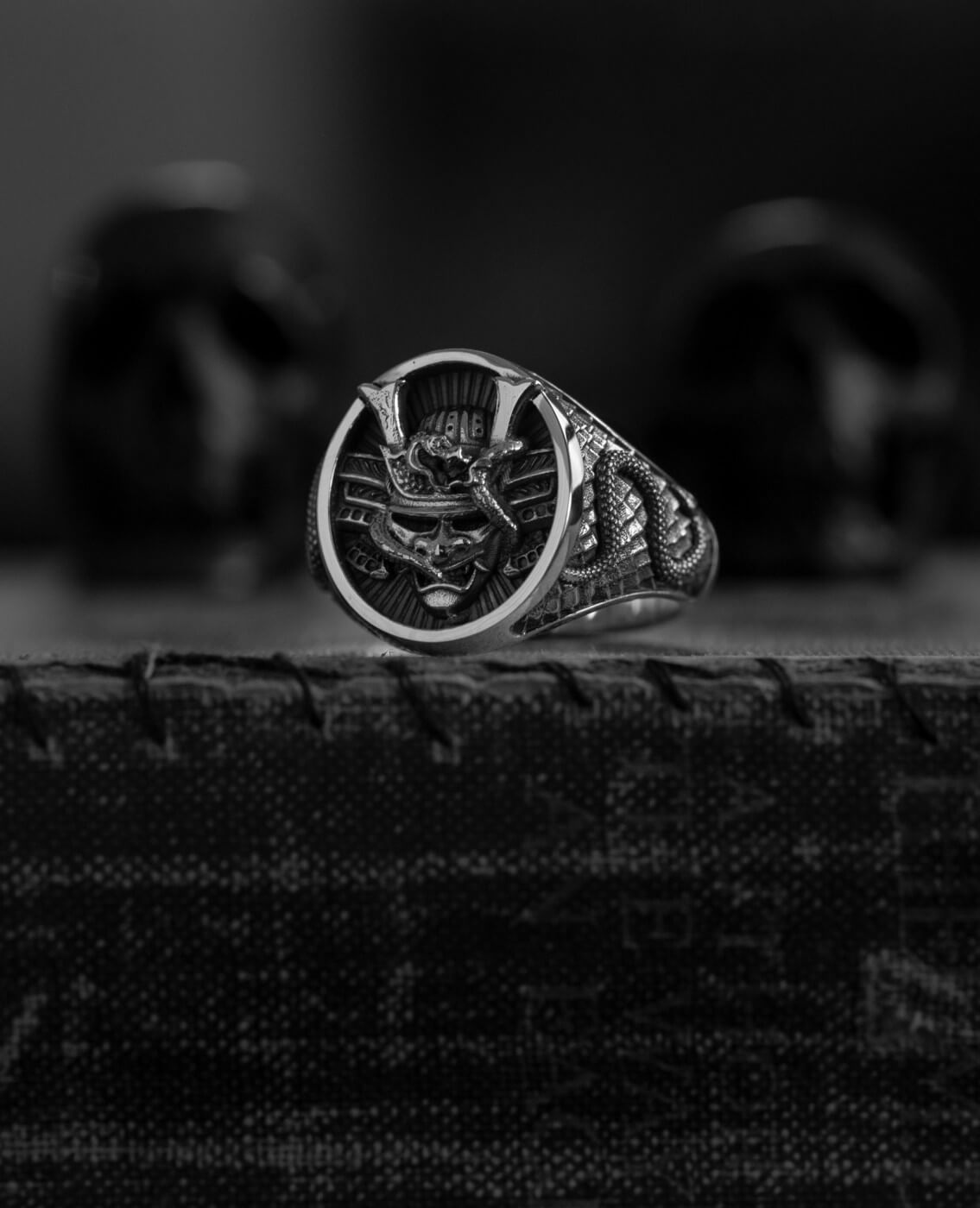
Ronin gets a visceral reaction from people. It’s aggressively proud about its image. No toe dipping, just strong design elements all the way through.
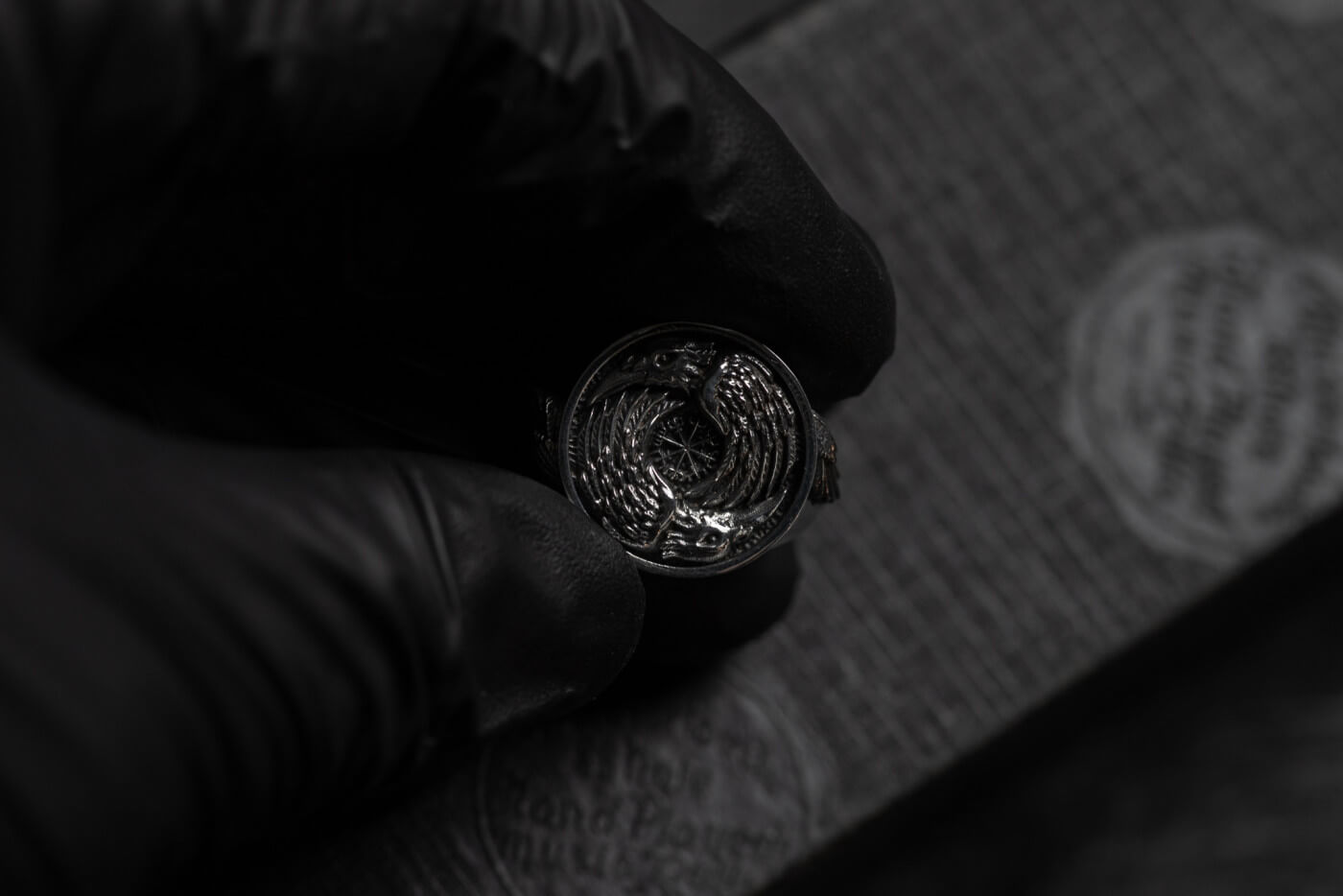
The shank is particularly notable for us, as we currently have a ‘creature’ design in the works that we’d used a similar texture. So it was a straightforward process to incorporate this, as we knew it worked well. I don’t want to labour the point, as we mention it waaay too much, but yes scales, texture, depth… All of that smack.
The concept is strong, based on the historical relevance of the samurai mask. Not unique or difficult to digest - it simply needs to lean on people's general perception of the samurai. Job done.
I usually need to shine a light on a design component that is nestled away and an amazing hidden detail - not with Ronin, he’s letting his balls hang out, so to speak. ‘Showing his cards’, may be a more traditional analogy.
It feels like you’d expect, on the hand. It’s a solid punter, bold visually and upwards of 19 grams. No one is buying this who didn’t come in knowing it from the get-go. I don’t see anyone being swung by a subtle nuance. It’s either you through and through or, get it outta my face.
Enjoy.
$345.00
2023 DESIGN COMPETITION WINNERVenomous Ronin, by Brandon Henderson. Design Specifications Sculptural signet of a warrior Sumari mask and serpent wrapping the shank and meeting the mask at the central focal point. Made from 925 Sterling Silver Face Size: 17.40 x 15.45mm… read moreVenomous Ronin